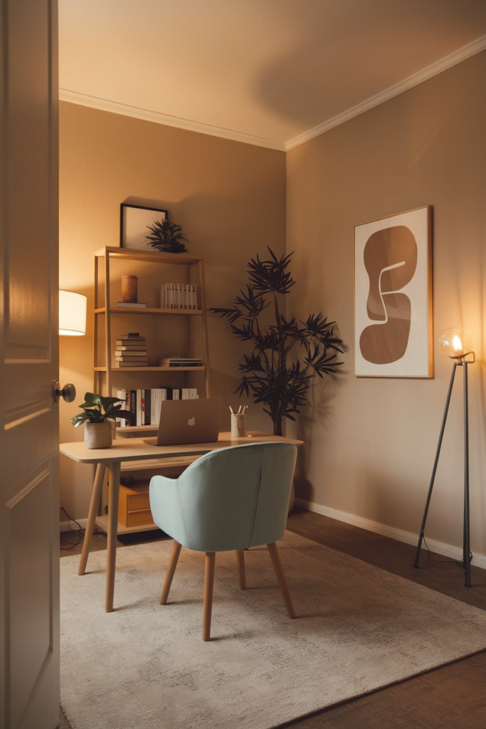
Top 27 Home Office Paint Colors for Stylish Workspaces
When it comes to creating the perfect home office, every detail matters. From the desk you choose to the lighting in the room, your workspace should inspire productivity while being a place you actually want to spend time in.
But one often overlooked (yet hugely impactful) factor? The paint color on your walls. The right shade can shift the mood, boost your creativity, and even help you stay focused on those marathon Zoom meetings.
1. Calming Blue
Blue is the universal color of calm. A soft, pale blue can create a serene environment, perfect for keeping stress at bay during hectic workdays. Opt for shades like Benjamin Moore’s “Palladian Blue” or Sherwin-Williams’ “Misty.”
Why It Works:
- Psychological Effects: Blue is known to lower stress and enhance focus.
- Best For: Analysts, writers, or anyone needing a tranquil mindset.
2. Energetic Yellow
Inject a dose of happiness into your workspace with yellow. Think buttery yellows rather than neon brights – you want energy, not overwhelm. Consider “Hawthorne Yellow” by Benjamin Moore.
Why It Works:
- Mood-Boosting Properties: Yellow evokes optimism and creativity.
- Best For: Designers, marketers, or entrepreneurs with big ideas.
3. Classic White
Sometimes simplicity wins. Crisp white walls, such as Behr’s “Ultra Pure White,” create a clean, distraction-free zone.
Why It Works:
- Enhanced Lighting: White reflects light, making small spaces feel larger.
- Best For: Minimalists and those who prefer a blank slate for brainstorming.
4. Sophisticated Charcoal Gray
Gray is anything but boring. It’s the ultimate neutral that pairs well with almost any accent color. Try Sherwin-Williams’ “Dovetail” for a chic, modern feel.
Why It Works:
- Versatility: Gray is grounding and professional.
- Best For: Those wanting a balance of style and seriousness.
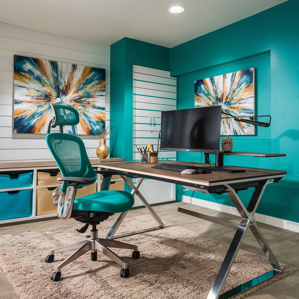
5. Invigorating Teal
Teal bridges the gap between blue and green. A shade like “Blue Peacock” by Benjamin Moore feels both bold and welcoming.
Why It Works:
- Dynamic Energy: Teal stimulates the mind while remaining calming.
- Best For: Creatives and those who thrive on variety.
6. Earthy Terracotta
Warm, inviting, and grounding, terracotta shades like Sherwin-Williams’ “Cavern Clay” bring the outdoors in.
Why It Works:
- Natural Ambiance: Earth tones connect us to nature.
- Best For: Anyone wanting a cozy yet professional vibe.
7. Peaceful Sage Green
Sage green is having a moment, and for good reason. Try “Saybrook Sage” by Benjamin Moore for a soft, sophisticated touch.
Why It Works:
- Relaxation Meets Focus: Green is easy on the eyes and promotes balance.
- Best For: Therapists, consultants, or anyone needing calm concentration.
8. Moody Navy Blue
Navy blue exudes confidence. It’s bold but not brash, creating a space that feels both professional and inviting. Check out Farrow & Ball’s “Hague Blue.”
Why It Works:
- Depth and Warmth: Navy makes a room feel grounded and intimate.
- Best For: Professionals aiming for a polished, executive feel.
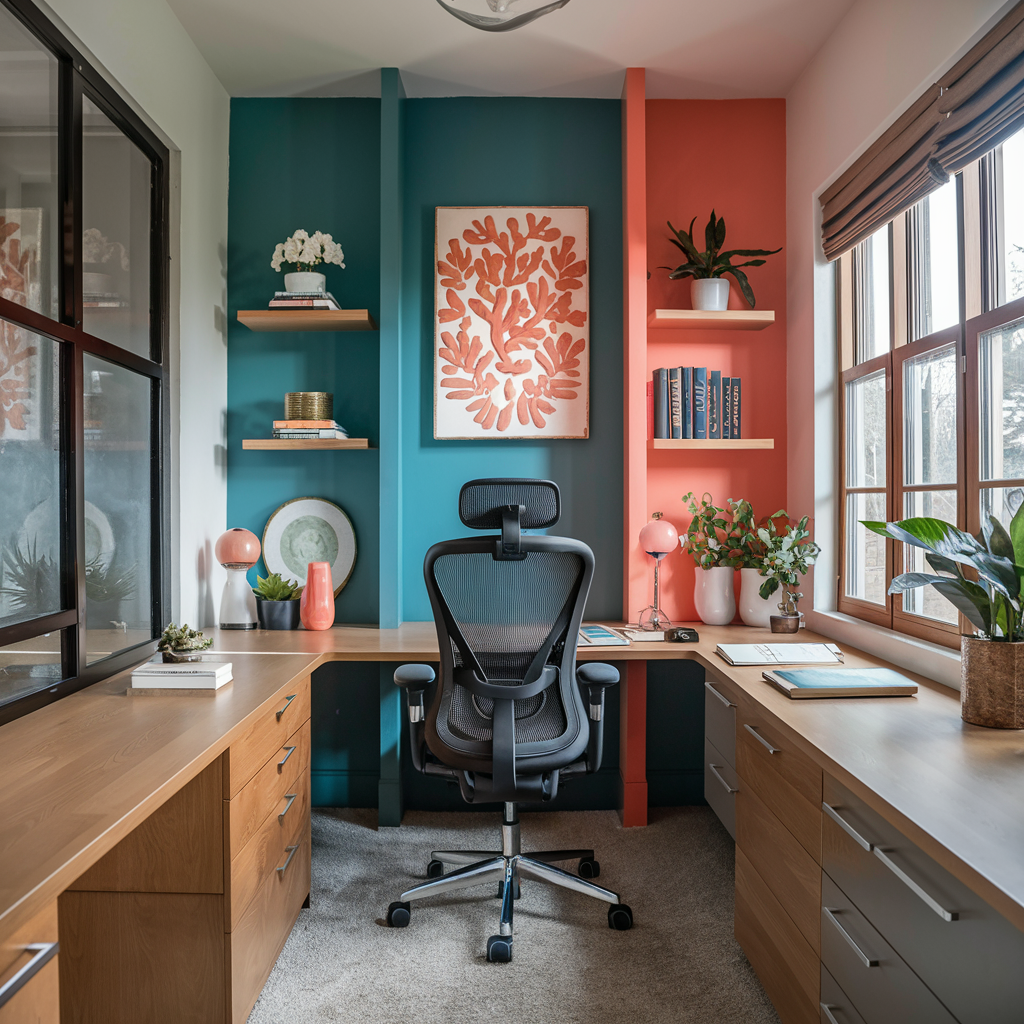
9. Playful Coral
Want something vibrant but not overbearing? Coral is your answer. Try “Living Coral,” Pantone’s Color of the Year 2019.
Why It Works:
- Creative Spark: Coral inspires energy without overwhelming.
- Best For: Artists and anyone who loves a pop of color.
10. Elegant Greige
A hybrid of gray and beige, greige (like Behr’s “Silver Drop”) offers the perfect backdrop for a modern, stylish workspace.
Why It Works:
- Subtle Sophistication: Greige is timeless and versatile.
- Best For: Those wanting a neutral palette with depth.
11. Warm Honey Beige
For a cozy and inviting look, honey beige is an excellent choice. Shades like “Manchester Tan” by Benjamin Moore create a warm glow.
Why It Works:
- Welcoming Atmosphere: Beige adds warmth without being overpowering.
- Best For: Writers, editors, or anyone seeking comfort.
12. Vibrant Emerald Green
Emerald green brings a sense of luxury to your workspace. Think “Hunter Green” by Benjamin Moore.
Why It Works:
- Bold Elegance: Green fosters creativity and prosperity.
- Best For: Entrepreneurs and visionaries.
13. Soft Lavender

Lavender is the perfect blend of calming and uplifting. Choose light shades like Sherwin-Williams’ “Silver Peony.”
Why It Works:
- Stress Reduction: Lavender helps to soothe the mind.
- Best For: Coaches, healers, or anyone juggling multiple tasks.
14. Industrial Concrete Gray
Concrete gray, like Behr’s “Natural Gray,” adds an industrial touch with a contemporary edge.
Why It Works:
- Modern Appeal: A neutral tone for sleek, minimalist spaces.
- Best For: Tech professionals and modern minimalists.
15. Bold Black Accent Walls
Black walls demand attention, but an accent wall prevents the color from overwhelming. Use a shade like “Tricorn Black” by Sherwin-Williams.
Why It Works:
- Dramatic Flair: Black adds depth and sophistication.
- Best For: High-impact, creative spaces.
16. Refreshing Mint Green
Mint green is cheerful without being overpowering. Try “Mint Condition” by Sherwin-Williams.
Why It Works:
- Energetic Vibes: Mint is uplifting and fresh.
- Best For: Innovators and out-of-the-box thinkers.
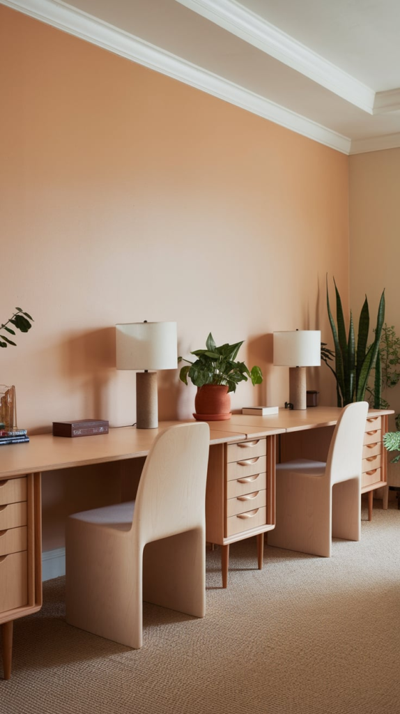
17. Cheerful Peach
Peach walls bring warmth and positivity. Look at shades like Benjamin Moore’s “Soft Peach.”
Why It Works:
- Inviting and Friendly: Peach is great for uplifting moods.
- Best For: Team leaders and educators.
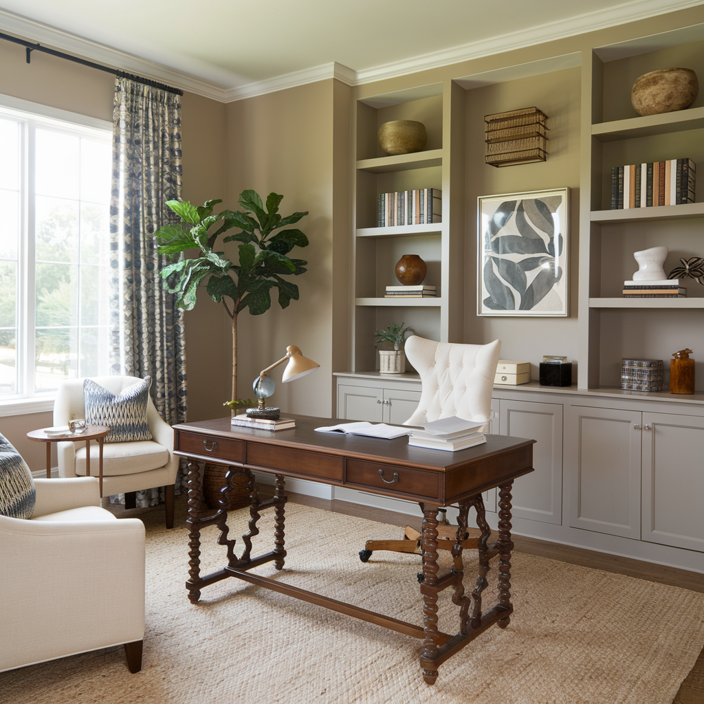
18. Understated Taupe
Taupe is the perfect neutral for adding subtle warmth. Consider “Revere Pewter” by Benjamin Moore.
Why It Works:
- Timeless Elegance: Taupe pairs beautifully with natural wood finishes.
- Best For: Professionals seeking understated style.
19. Rustic Olive Green
Olive green is earthy and grounding. Check out “Olive Grove” by Sherwin-Williams.
Why It Works:
- Connection to Nature: Perfect for reducing eye strain.
- Best For: Architects or nature lovers.
20. Dramatic Burgundy
Burgundy walls ooze sophistication and style. Go for “Deep Maroon” by Sherwin-Williams.
Why It Works:
- Rich Warmth: Burgundy fosters a sense of luxury and focus.
- Best For: Lawyers, accountants, and other polished professionals.
21. Bright Aqua

For a splash of fun, try a bright aqua shade like Behr’s “Tahitian Breeze.”
Why It Works:
- Playful Energy: Aqua sparks joy and creativity.
- Best For: Content creators and artists.
22. Warm Cinnamon
Cinnamon tones add depth and coziness. Try “Fired Brick” by Sherwin-Williams.
Why It Works:
- Inviting Warmth: Ideal for homey workspaces.
- Best For: Bloggers and remote workers.
23. Sunny Apricot
Apricot is a softer take on orange. Consider “Apricot Butter” by Behr.
Why It Works:
- Subtle Energy: A cheerful yet understated choice.
- Best For: Teachers and consultants.
24. Dusty Rose
Dusty rose is both calming and sophisticated. Look at “Mellow Coral” by Benjamin Moore.
Why It Works:
- Romantic Vibes: Adds softness without being overly feminine.
- Best For: Writers and therapists.
25. Steel Blue
Steel blue combines the calm of blue with a touch of gray. Consider “Blue Arrow” by Behr.
Why It Works:
- Cool and Collected: Keeps the mind focused and clear.
- Best For: Engineers and planners.
26. Golden Ochre
This deep yellow-orange shade adds warmth and personality. Check out “Golden Field” by Behr.
Why It Works:
- Vibrancy with Depth: A bold but not overpowering hue.
- Best For: Creatives and innovators.
27. Rich Plum
For a dramatic yet inviting look, try deep plum shades like “Shadow” by Benjamin Moore.
Why It Works:
- Sophisticated Creativity: Plum inspires imagination and focus.
- Best For: Artists and designers.
Conclusion
Your home office is more than just a place to work – it’s a reflection of your personality and a space to fuel your ambitions.
Whether you’re drawn to the calming vibes of sage green or the bold statement of burgundy, there’s a paint color here to match your style and needs.