Discover 23 Stunning Exterior House Colors: Modern Trends
Choosing the right exterior color for your house can feel like staring at a blank canvas, ready to be filled with a shade that captures your personality, your home’s architectural style, and its place in the surrounding landscape.
The wrong color can make your dream home look out of place, while the right hue can make it feel like a masterpiece.
Whether you’re revamping a suburban ranch, renovating a Victorian, or creating a sleek, modern retreat, the color you select sets the tone for your home’s personality and curb appeal.
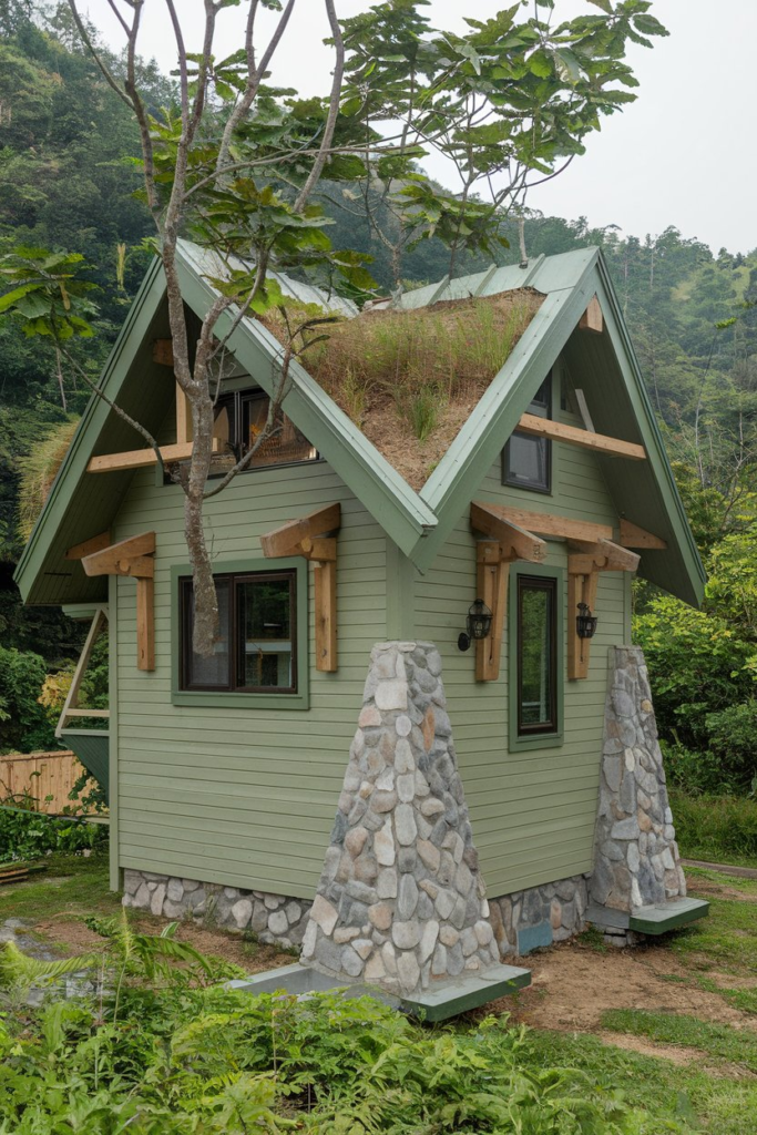
1. Sage Green: A Serene, Nature-Inspired Hue
There’s something undeniably calming about sage green, a color that effortlessly connects a home with its natural surroundings. This muted shade of green, often seen in gardens and forests, provides a serene, inviting atmosphere. Paired with white trim and natural wood accents, sage green becomes a versatile option for modern homes looking to embrace an organic aesthetic.
Why it works: Sage green blends well with most landscapes, particularly in areas surrounded by greenery, making it a perfect choice for homes located in wooded or rural settings. It also evokes a sense of peace and tranquility, ideal for creating a relaxed and welcoming environment.
2. Charcoal Gray: Bold and Elegant
If you’re aiming for a sleek, modern look with a touch of sophistication, charcoal gray is a go-to. This deep, dark shade has become a staple in contemporary design due to its ability to pair well with almost any accent color, from bright whites to vibrant yellows. The richness of charcoal gray gives your house an urban, chic feel without being too overpowering.
Why it works: Gray is neutral, allowing other design elements—like landscaping, lighting, and architectural details—to shine. It’s also an excellent choice for homes in areas where you want to make a statement without being too flashy.
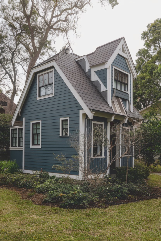
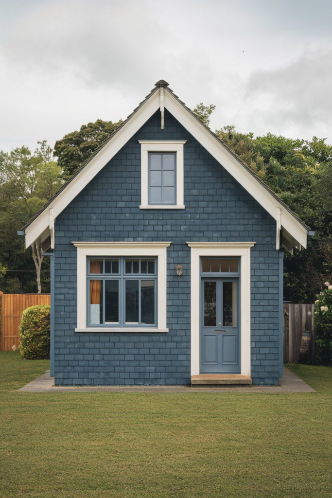
3. Nautical Blue: Timeless and Refreshing
There’s a reason why shades of navy and ocean blue never seem to go out of style. The nautical blue exterior is reminiscent of coastal homes, bringing a refreshing, timeless feel to any property. This color works particularly well with white trim and wooden decks, creating a classic beach house aesthetic that never feels dated.
Why it works: Nautical blue is versatile enough to complement a wide range of architectural styles. Whether you live by the coast or in a suburban area, it adds a sense of tranquility and calm, evoking thoughts of endless summer days by the water.
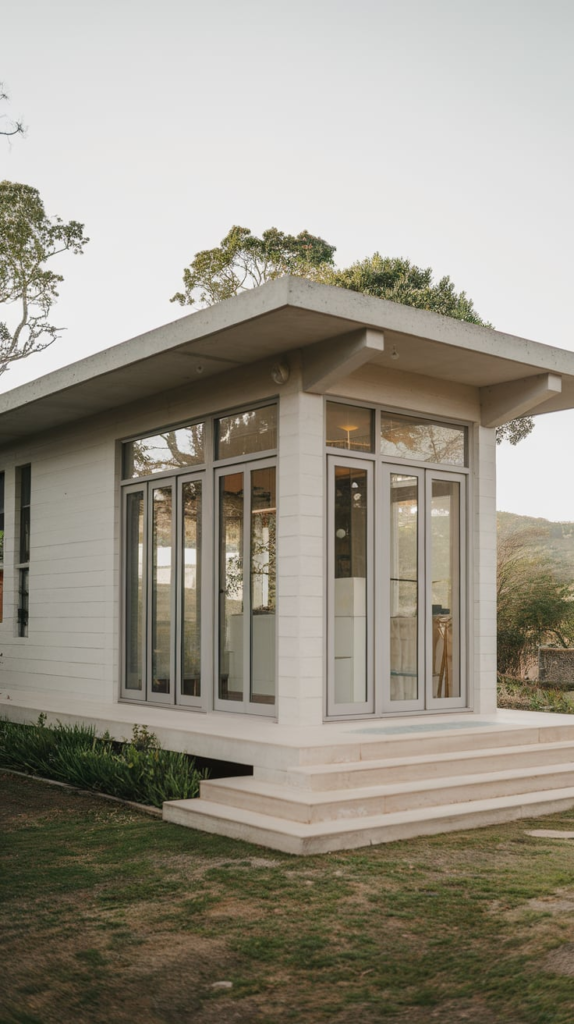
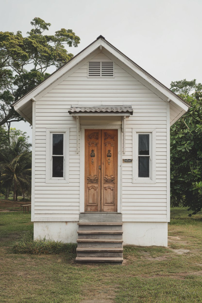
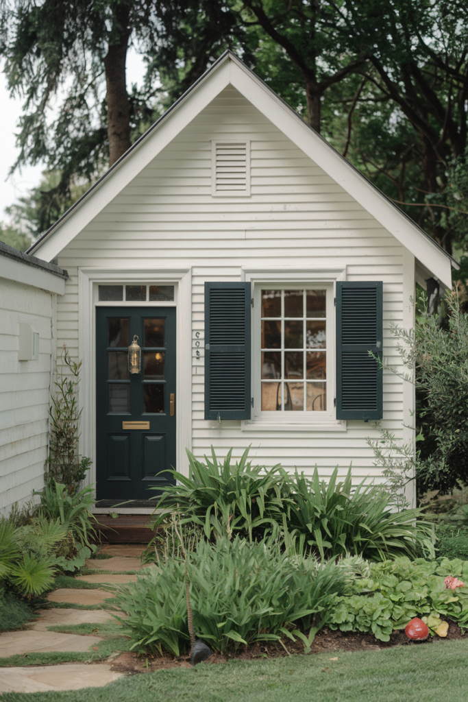
4. Classic White: The Ultimate Blank Canvas
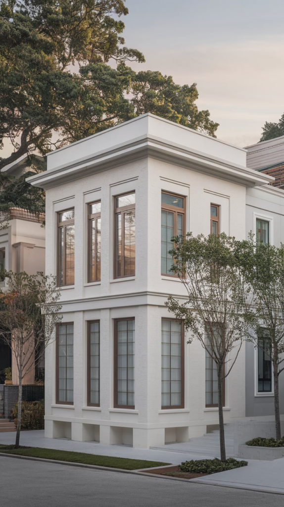
White is often considered the classic choice for home exteriors, but don’t be fooled by its simplicity. White never goes out of style because it offers a timeless appeal that suits all architectural types. It’s clean, fresh, and versatile, acting as a backdrop for architectural features, landscapes, and unique details.
Why it works: White offers flexibility. It allows other elements, such as colorful front doors, greenery, and outdoor lighting, to stand out. It’s also a great option for homes in warmer climates, as it reflects heat and helps to keep the interiors cooler.
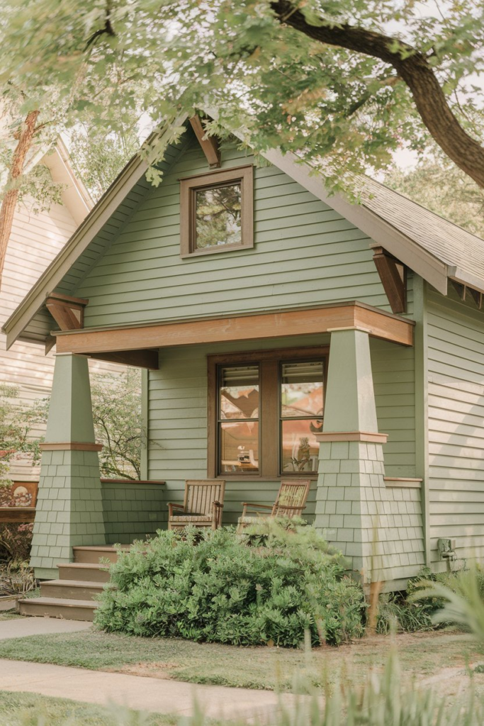
5. Deep Forest Green: A Classic Connection to Nature
When you’re looking for a color that feels like it’s always been part of the landscape, forest green is the perfect option. This deep, earthy shade blends seamlessly into wooded areas, making it an ideal color for homes surrounded by nature. It evokes a sense of stability and connection to the natural world, without being too bold or overbearing.
Why it works: Forest green is a timeless classic. It provides a sophisticated, subdued option for homeowners who want something that feels grounded and natural without drawing too much attention.
6. Warm Taupe: Subtle Sophistication
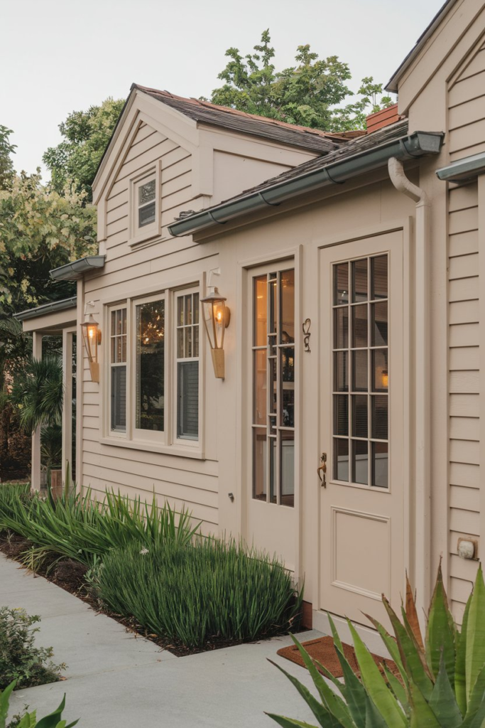
For those who crave a neutral tone that isn’t just another shade of beige, warm taupe is a fantastic choice. It’s a bit richer and deeper than traditional tan, offering a sophisticated look that works with virtually any architectural style. Whether your home is traditional or modern, this versatile hue can highlight the best features of your property.
Why it works: Warm taupe blends effortlessly with both classic and modern finishes. It provides warmth and coziness without the starkness of traditional neutrals, making it a top choice for homeowners who want to add personality without going too bold.
7. Soft Coral: Bright, Inviting, and Fun
If you’re in the mood to inject some fun and personality into your home, soft coral is a warm, welcoming color that never fails to catch the eye. This shade balances pink and orange tones, evoking warmth and playfulness, and is perfect for homeowners who want to stand out from the crowd.
Why it works: Coral works particularly well in areas with lots of sunlight, as it complements both natural and artificial light. It’s bold enough to make a statement but still soft enough not to overwhelm.
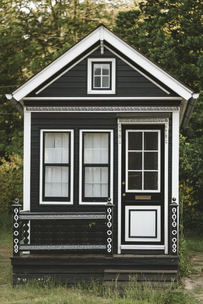
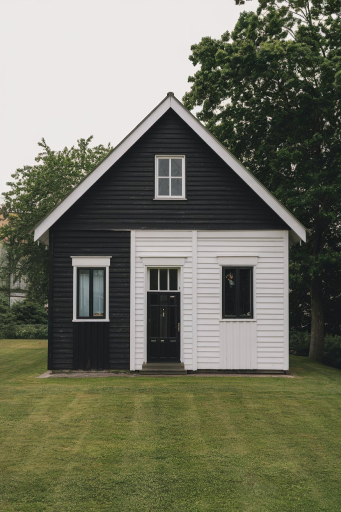
8. Crisp Black: The Bold, Modern Statement
For a contemporary twist on the traditional dark exterior, crisp black has become increasingly popular. When done right, a black house is both elegant and daring. It provides contrast, making architectural details and landscaping stand out, all while maintaining a sleek and modern appearance.
Why it works: Black exudes sophistication and minimalism, turning your home into a bold statement piece. It pairs beautifully with metallic accents, natural stone, and lush green landscapes.
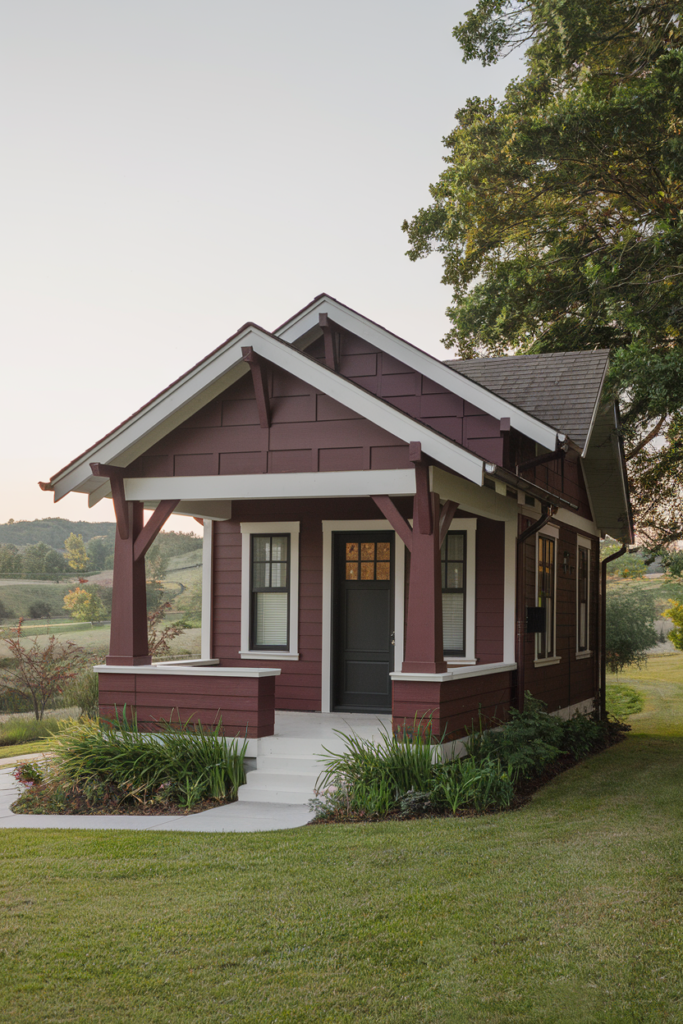
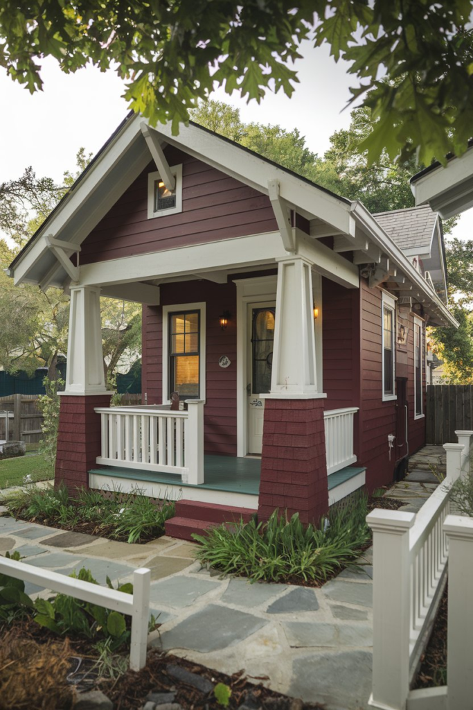
9. Rich Burgundy: A Statement of Classic Elegance
If you’re looking for something that brings a touch of elegance and charm, burgundy is an excellent choice. This deep, rich color adds warmth to any home, and when paired with neutral trim, it creates a balanced, classic look that still feels fresh.
Why it works: Burgundy adds a layer of sophistication and grandeur. It’s perfect for homes with traditional architecture or those looking to embrace a classic, refined aesthetic.
10. Dusty Rose: Soft and Inviting
For a unique but still classic look, dusty rose offers a softer approach to traditional colors. This muted shade of pink adds a touch of romance and warmth without being overly feminine or bright. It pairs perfectly with neutral trim, creating a soft contrast that’s both welcoming and serene.
Why it works: Dusty rose works well in areas where you want to evoke a sense of calm and nostalgia, making it ideal for Victorian-style homes or charming cottages. It’s also a beautiful way to add a pop of color without overwhelming the senses.
11. Elegant Ivory: Timeless Sophistication
When white feels too stark, ivory is a beautiful alternative. Softer and warmer than its pure white counterpart, ivory brings a sense of elegance and warmth to any home. It’s perfect for creating a classic look while maintaining a welcoming, open atmosphere.
Why it works: Ivory pairs effortlessly with other neutrals and bolder accent colors, providing a versatile backdrop for your home’s architectural features and landscaping.
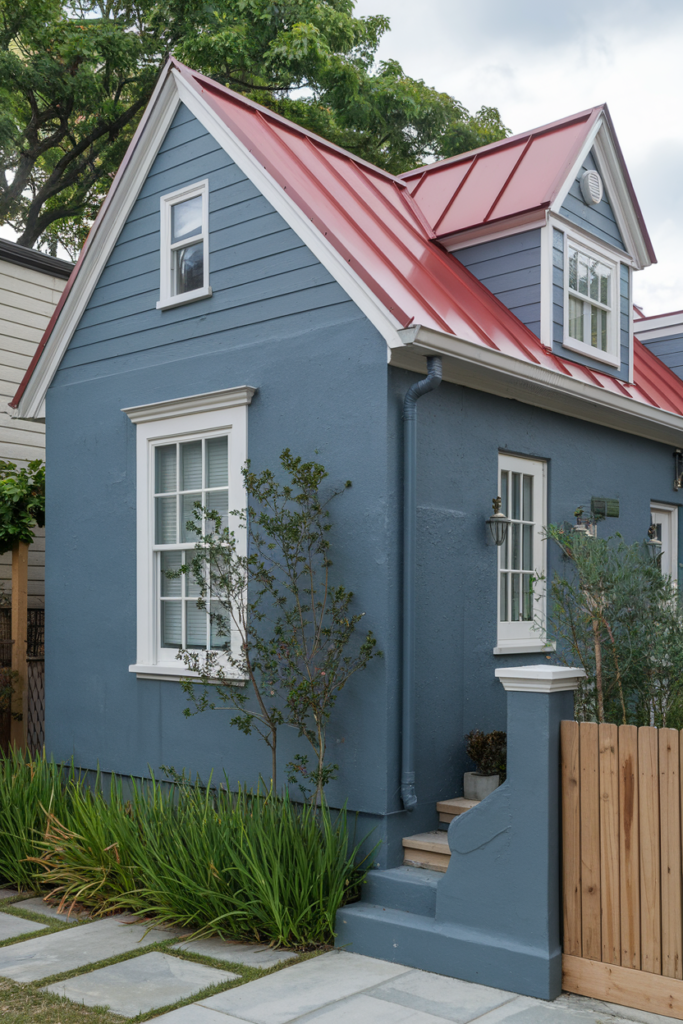
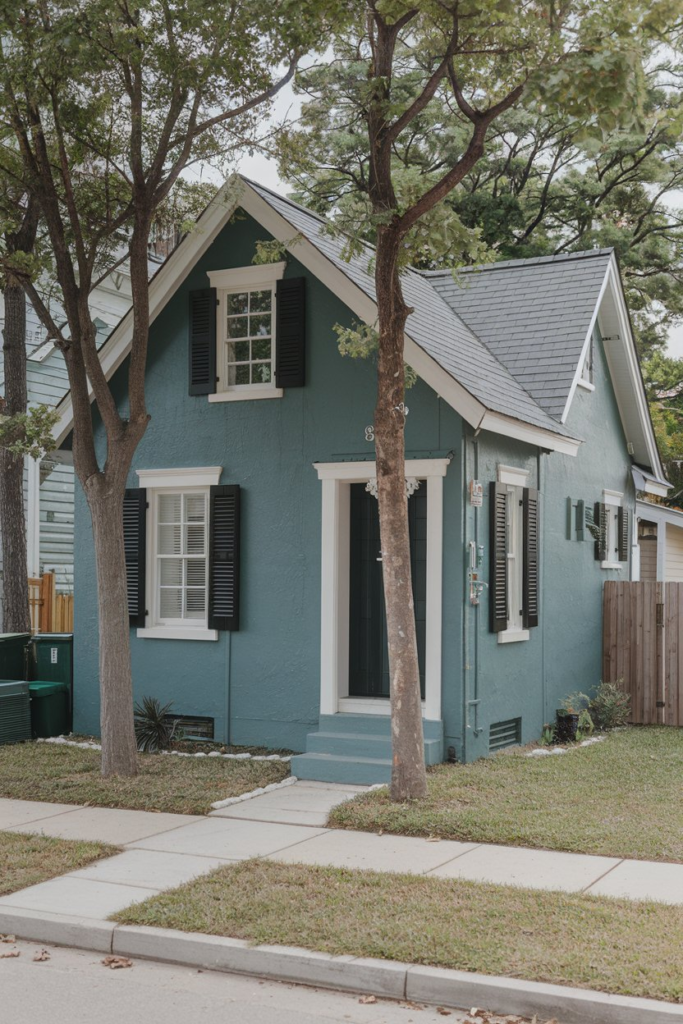
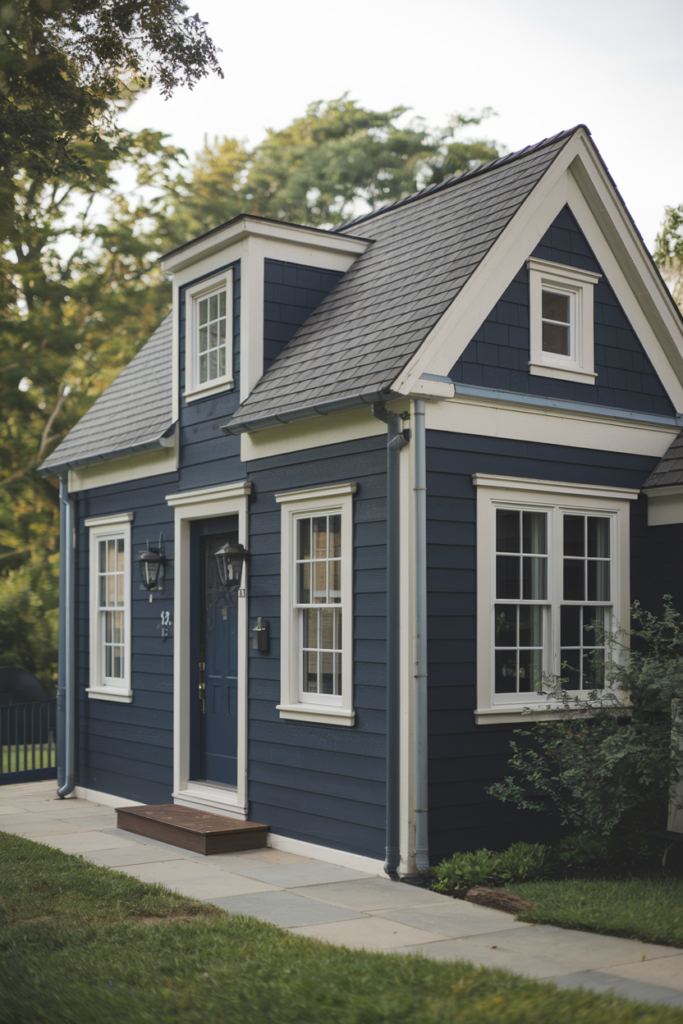
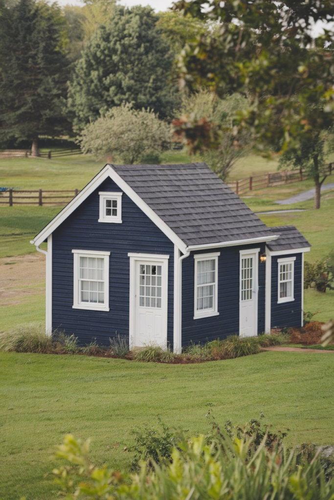
12. Rich Navy: Understated Boldness
Navy blue brings depth and sophistication to any exterior, making it an ideal option for those who want a darker, yet still colorful, choice. Navy’s timeless appeal works well with white trim, creating a clean contrast that looks particularly stunning on coastal homes or properties with modern elements.
Why it works: Navy is versatile, suitable for both traditional and modern homes. It’s bold without being overpowering, and it pairs beautifully with metallics and wood tones for a balanced look.
13. Pale Aqua: Soft, Cool Elegance
Looking for a color that feels refreshing and cool, but not too cold? Pale aqua strikes the perfect balance. This soft, pastel blue has just enough warmth to make it inviting, but still provides a light and airy feel that’s perfect for summer homes or properties near water.
Why it works: Aqua blends well with white or gray trim, creating a serene, beachy vibe that’s timeless yet modern. It’s ideal for homes in coastal or lakeside areas.
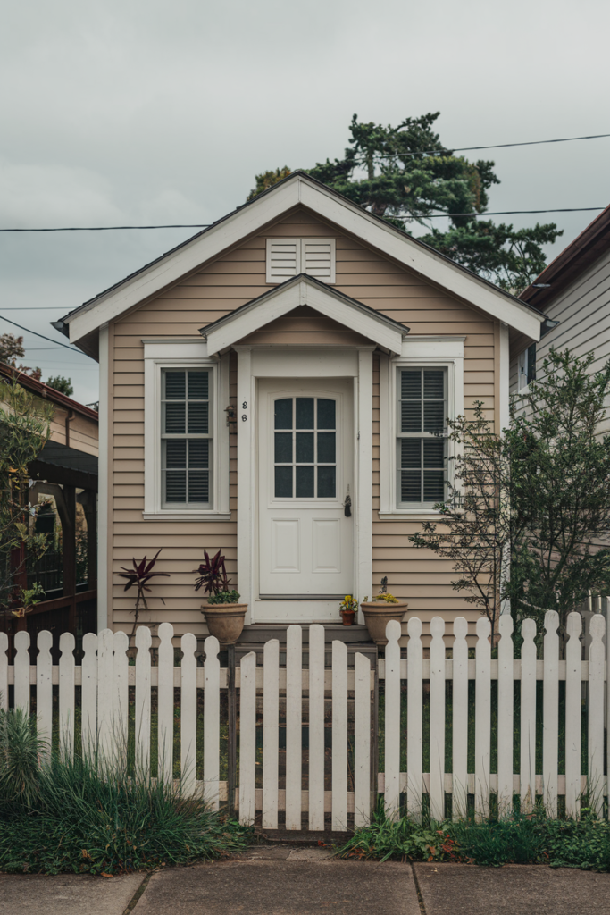
14. Warm Cream: A Cozy Classic
If white is a bit too bright, cream is a soft, warm alternative that adds a bit more character to the exterior of your home. Cream is a timeless classic, offering warmth without the starkness of beige or yellow. It works well with traditional homes and creates a cozy, welcoming atmosphere.
Why it works: Cream adds warmth to your home’s appearance while still maintaining the clean look of lighter neutrals. It’s the perfect balance of soft elegance and practicality.
15. Soft Mint: Playful Yet Elegant
If you love the idea of a cool, refreshing color that stands out, mint green is an excellent choice. This gentle, pastel hue adds personality without being too bold or loud. Mint is especially appealing when paired with white trim and natural wood elements, creating a cheerful yet sophisticated aesthetic.
Why it works: Mint is a versatile color that works well in warmer climates, and it pairs beautifully with modern or retro-inspired home designs. It’s playful yet elegant, perfect for homeowners who want something unique.
16. Light Gray: Subtle Sophistication
For those who love the sophistication of gray but want something a bit lighter than charcoal, light gray is a beautiful option. This shade offers a sleek, modern look without being too stark or severe. It’s an excellent choice for homeowners who prefer understated elegance.
Why it works: Light gray pairs well with almost any other color, including bolder accents and natural materials like stone or wood. It’s a timeless and versatile choice that never feels too trendy or temporary.
17. Muted Mustard: Warm and Unexpected
For an exterior color that’s both bold and unexpected, muted mustard offers a refreshing alternative to more common shades. This warm, golden yellow has a sophisticated undertone that works particularly well in modern and transitional home styles.
Why it works: Muted mustard adds warmth and depth without being overwhelming. It pairs beautifully with darker accents like gray or charcoal, making it ideal for homeowners looking for a bit of drama and flair.
18. Olive Green: Earthy Elegance
If you’re drawn to colors that bring the outdoors in, olive green is an earthy, elegant option. This rich, natural tone has an understated appeal that works well with both traditional and modern homes. It pairs beautifully with white or cream trim and natural stone accents.
Why it works: Olive green evokes a sense of calm and connection to nature. It’s a fantastic choice for homes surrounded by trees or in rural, more rustic settings.
19. Soft Lavender: A Fresh, Dreamy Touch
For those who love color but want something that feels delicate and dream-like, soft lavender provides a fresh and feminine alternative. This pastel purple offers a serene and tranquil atmosphere, perfect for homes near gardens or flower-filled landscapes.
Why it works: Lavender pairs beautifully with soft greens, pinks, and whites, creating a whimsical yet sophisticated look that’s both calming and vibrant.
20. Brick Red: Warm and Inviting
If you’re aiming for a classic yet bold exterior color, brick red offers warmth and richness without being overly brash. This color works particularly well on homes with traditional brick facades or homes with a rustic or farmhouse aesthetic.
Why it works: Brick red provides a sense of coziness and warmth while standing out in a way that’s still grounded and natural. It pairs beautifully with earthy tones, such as browns and creams, to complete the rustic appeal.
21. Smoky Plum: Bold, Rich, and Inviting
For something truly unique, smoky plum offers a rich, bold hue that’s not often seen in traditional home exteriors. This deep, muted purple combines sophistication with warmth, offering a refined yet inviting look. It pairs well with gold or brass accents for a luxurious finish.
Why it works: Smoky plum is perfect for homeowners who want to embrace a daring, yet timeless look. It works beautifully in combination with neutral tones, adding depth and complexity to your home’s overall appearance.
22. Copper Brown: Warm and Earthy
For a touch of rustic charm, copper brown offers an earthy, industrial feel that works well with homes that have lots of natural materials, such as wood or stone. This warm, metallic brown color brings a rich and grounded energy to your home’s exterior.
Why it works: Copper brown is a versatile color that’s bold yet warm, creating a welcoming environment that feels naturally sophisticated.
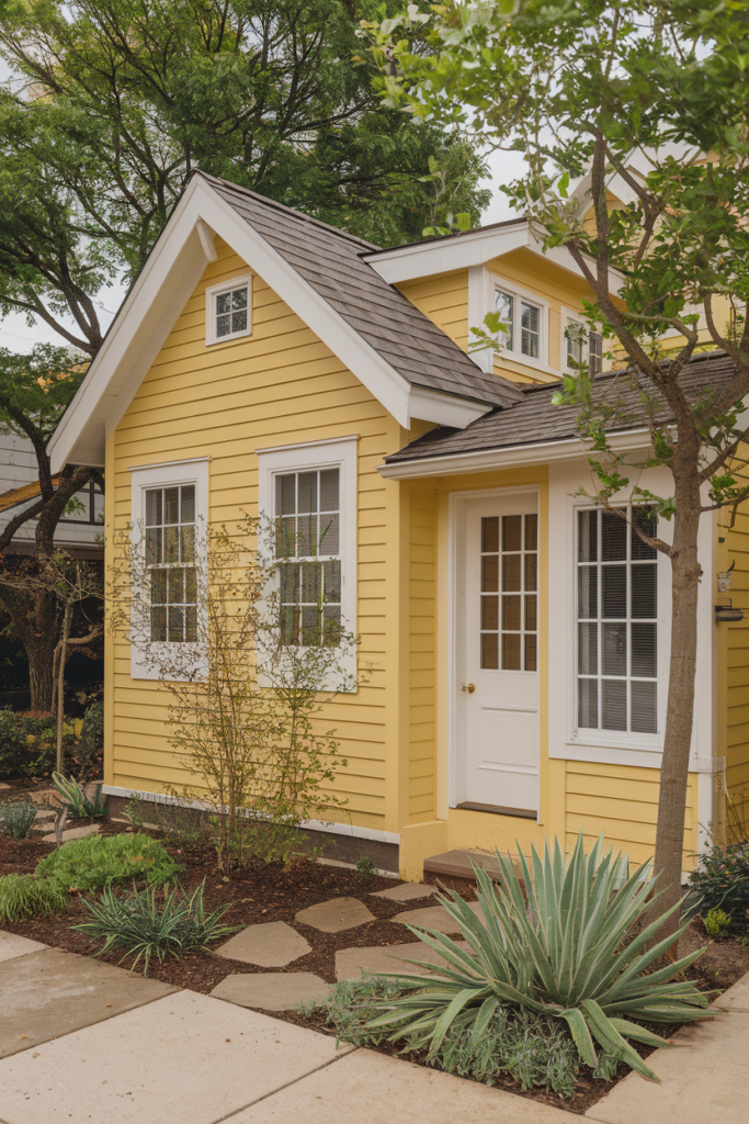
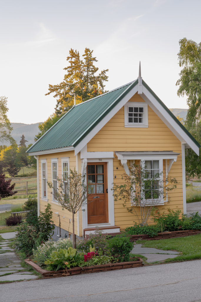
23. Soft Butter Yellow: Cheerful and Inviting
Finally, for homeowners who want to embrace a sunny, cheerful atmosphere, butter yellow is a soft and inviting choice. This gentle yellow hue evokes feelings of warmth and happiness, making it perfect for homes with large front porches or those situated in sunny climates.
Why it works: Butter yellow adds a touch of cheerfulness without being too bright or overwhelming. It pairs beautifully with greenery, flowers, and other pastel tones, creating a warm and welcoming home.
Conclusion
Choosing the right exterior color is more than just picking a paint swatch off the shelf.
It’s about finding a color that resonates with you, complements your home’s architectural style, and fits in with the surrounding landscape.